My name is Juliette Wileman (0875), and this is my A2 Media Studies Coursework blog. I am working in Group 3 along with Audrey King Lassman (0397), Brandon Poonwasie (0660), and Chrystal Li (0470).
To navigate around my blog, use the labels on the left side, below the Labels heading.
Thank you!

Website

Album Art Digipack

Album Art Digipack

Music Video

Monday, 13 October 2014

Storyboarding

Once we had broken down the lyrics and worked out a structure for our video, we began to plan shots that we wanted for our video. Initially we did this by set up, and used different colours for different eras, such as yellow for modern and pink for 50s. This meant we could work out what we needed to do for each era set-up and the band set-up, and it also meant that we made sure to include the right inter-textual reference for each era, for example, having the right props.

We then put the storyboard in chronological order so as to find and resolve any gaps that we may have left, and also so we could start our animatic.

Production Meeting - Lyric Breakdown


In a lesson, me and Chrystal initially time-coded the lyrics, and used this to break down the song into sections, to which we then allocated eras. We also started to note down any influences and inter-textual references we could include, such as Saturday Night Fever for the 70s, or a juke box for the 50s. We then discussed this further in a group production meeting, and agreed on a final structure. By doing this, we were able to develope more detailed shot ideas for the storyboard, such as the couple bumping into one another on their phones for the initial meet in modern times.

Production Meeting - Website

As a group we decided that we wanted a landing page before our actual website, with the logo of the album, and the band, as the only thing on the page (the logo is pictured below) - which was my second website design.
We also developed my initial idea of having images as links to other pages for the main site. Instead, we want the
website to have the same layout, but with a navigation bar on top, and the images will actually have the most recent post from that category (such as upcoming tour dates), which can then be clicked on to lead to the relevant page. We thought that it would be better to have content on the first page leading from the landing page, rather than have the audience have to click more to get to information.

The website will have the band logo, and a consistent colour scheme so as the anchor the band image and brand. It will also have images of the band to further portray their image - which is, in this case, indie.
The band logo and possible design.

We were influenced by the layout of The 1975 website, which is like a collage with images and information, but with a navigation bar at the top. However, we don't want to have the continuous stream of information.


We decided that the landing page would feature the album artwork, as this would anchor the brand of the band and the album. We decided to keep the colour scheme constant too, making the website dark grey with white text and neon outlines. This again anchors the brand of the band and album. Picture below and to the right are the flat plans for our website, which we will create on Wix.

Production Meeting - Album Art


We decided that we wanted the album to be self-titled, and that the album art would only be the album name, shown by my initial sketch to the left and the notes above. We were influenced by bands such as San Cisco, Franz Ferdinand and The 1975, who are all indie or alternative artists who self-titled their debut album. We were also influenced by the album art of Franz Ferdinand by Franz Ferdinand, and Discovery by Daft Punk. We also want the inside design to be an image of the band, and we want the back cover to be minimalist like the front - it will only feature the track names. This is influenced by the album art for The 1975, which has the band posing on the inside of the box, and the track names in a simple white font for the back cover.
The band posing on the inside of the album cover.

The minimalistic track list design.

Neon Colouring
Gold Effect
I produced font tests, trying out different designs. We have decided on the neon colour design, as we feel this most fits the genre of our band, which is indie or slightly indie pop. We also think that the design is more cheerful and eye-catching, and that the gold design does not suit the genre of our band.


Above are other designs that we tested and decided were not what we wanted for the album cover - we all thought that the design was better if the background was black, or very dark grey in the case of the neon colouring.


Tuesday, 7 October 2014

Production Meeting - Publicity Shots

For our publicity shots, we decided that we wanted a more playful feel to our shots, as we thought this fit the mage of the band well, and would also be easier to pull off and more fun to do. We also decided that we would use one of the shots for the inside of the album, and that we would also have a promo shoot for the album, a promo shoot for the music video, and behind the scenes shots.


Ideas that we particularly liked included the band wrapping the lead singer up in the microphone wire (my idea), the band dressing the lead singer up in era clothing (Audrey's idea), the band giving each other piggy-backs (Brandon's idea), the lead singer in the foreground trying to be serious whilst the band messes around in the background (Chrystal and Audrey's idea) and the band 'taking a selfie' (my idea).

In this meeting, we also started to discuss the actual timeline of the video, and we have decided on the basic structure of our video (such as which era is at which point in the song and so on), and we agreed to work on detail in our next meeting.

The set-ups we want for our publicity shots are:
  • behind-the-scenes of the music video shoot
  • the 'couple' from the video to promote the video
  • the band together to promote the album and the band as a whole
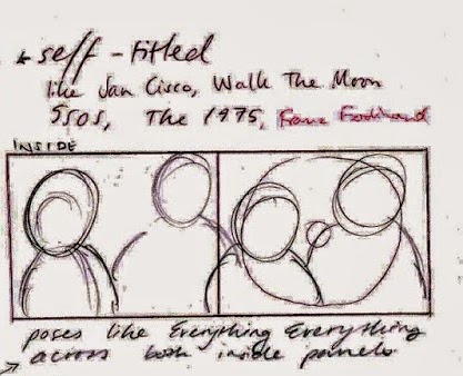
We drew inspiration from publicity shots of bands such as:

5 Seconds Of Summer
We liked the playfulness of the shots, and how the band were messing around - this connotes the genre of the band (pop rock). We thought that emulating this light-heartedness would firstly give the band an image of being fun and innocent, but would also connote the indie (and indie pop) genre of our band and single.


Everything Everything
We were also influenced by this band, as it is a similar genre to our own band. We liked the style of the shot, as it had different levels, making it more interesting. The outfits connote the indie genre, along with the pose - only the lead directly addressing the audience. Whilst we wanted something slightly more playful than this shot, we were inspired by this shot.


Little Dragon
We also drew inspiration from this promotional shot for this band, due to the bright colours and interesting pose. We thought that the bright colours connoted the upbeat style of music produced by the band, and we felt that emulating this would effectively connote the indie/indie pop genre of our band. We also liked the different levels again, and we want to take publicity shots like this one for our band.

Production Meeting - Album And Website Designs

We decided the meeting before what we were going to discuss in the next meeting; we used our group Facebook page to remind each other what was needed for the meeting.


Thursday, 2 October 2014

Steal-O-Matic

steal-o-matic is a visual, moving image 'pitch' of our music video idea, and includes reference points and inspirations.


For our steal-o-matic, we gathered together our inspirations discussed in production meetings, as well as finding reference points for the eras that we had decided - Ancient Greek, Viking, Victorian, 50s and 80s. We edited these together in a loose order for what we plan to do for our actual music video, and we added text to explain what the clips were meant to be representing. We then got feedback on the steal-o-matic;


  • Firstly, we decided that we may use a microphone similar to that in the second clip, as one is available to us.
  • We also listened to the feedback in terms of our idea being too complicated due to jumping too far between eras - this would confuse audiences as the video would jump between historical and pop culture references. To remedy this, we decided to change the eras to 50s, 70s, 80s and 90s instead for many reasons; the costumes would be easier to source and the eras are more recognisable to our target audience, for example.
  • We also came to the conclusion that we had to screen test Brandon and an external actor (Jacob) to decide the lead role.