My name is Juliette Wileman (0875), and this is my A2 Media Studies Coursework blog. I am working in Group 3 along with Audrey King Lassman (0397), Brandon Poonwasie (0660), and Chrystal Li (0470).
To navigate around my blog, use the labels on the left side, below the Labels heading.
Thank you!

Website

Album Art Digipack

Album Art Digipack

Music Video

Sunday, 21 December 2014

3) What Have You Learned From Your Audience Feedback?

In order to gain audience feedback, we used SurveyMonkey to conduct an online, anonymous survey, along with interviewing our audience. We also asked peers to watch and give feedback on our texts during construction.

OUR TARGET AUDIENCE
Our audience are primarily indie fans of all genders, and our secondary audience are those between 16 and 25 years old, although we feel our video appeals to all ages. When planning our music video, we took into consideration what would appeal to our target audience:
Our initial description of our target audience.
APPEALING TO OUR AUDIENCE
However, we also decided to make some parts of our texts appeal more to certain ages or genders; firstly, I feel that our video appeals mostly to our secondary audience, who are more contemporary, as the references made are to texts that are popular within that generation, such as F.R.I.E.N.D.S and Grease.
However, our video also appeals to women as we cast a conventional 'attractive male' as the lead singer, which is common in indie bands, such as lead singers Danny Jones and Tom Fletcher from McFly. This especially appeals to 13-16 year olds, who can imagine themselves in a relationship with the lead singer.
On the other hand, our band, and video still appeals to both genders, as the band is made up of two men and women, therefore any gender and sexuality can imagine themselves dating any member, for example. We thought it was important to have an equal number of genders within the band, as it avoids skewing to one gender, and it also means both genders are represented equally.

In our music video, it would also be expected to appeal more to women, as it features the stereotypical 'meet and fall in love' cliché narrative, which typically appeals mainly to women. However, through the interviews and survey we conducted, it became apparent that this narrative also appealed to men, and it didn't cause them to enjoy the video any less.

USES AND GRATIFICATIONS
We referenced Blumler and Katz's Uses And Gratifications Theory when making our video, as we wanted to ensure we appealed to our audience as much as possible, and therefore encouraged them to both purchase the album, and become a fan of the band.

DIVERSION
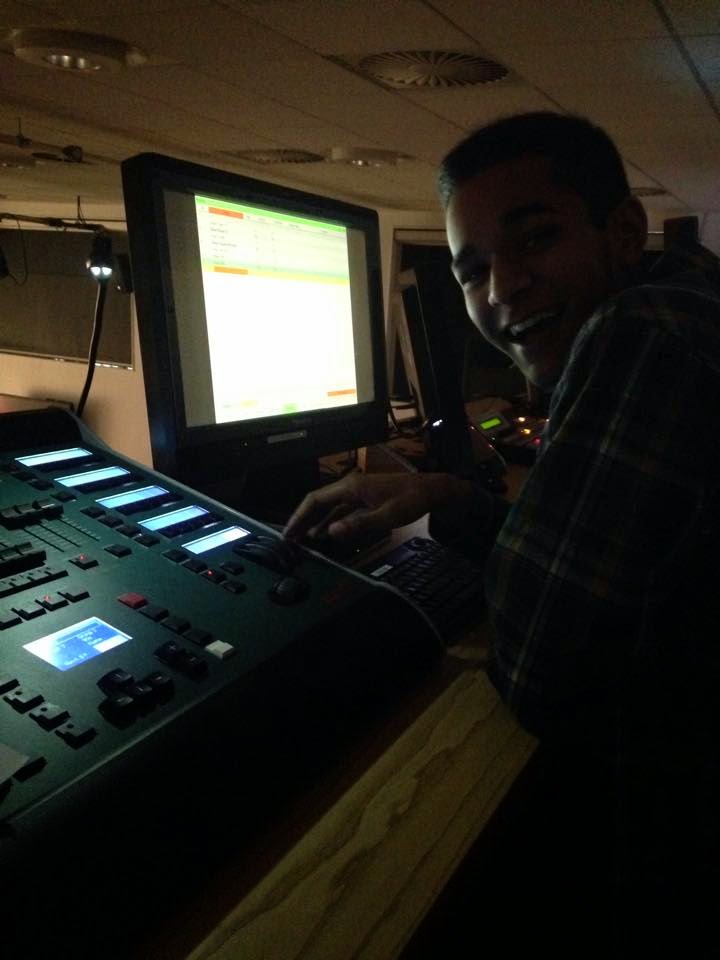
I feel that our music video is entertaining - the dance sequences are a particular example of this, as we used bright colours, energetic dancing and interesting editing techniques, such as having three eras on the screen at once:
We drew inspiration from Meghan Trainor's video, in which there is a dance sequence where it cuts quickly between each dancer. As a group, we liked this technique as it was eye-catching and interesting, and we felt that it would fit with the pace of the song.

RELATIONSHIPS
Our music video provides the audience with an interesting view of relationships - whilst it is clichéd, it is also giving a sincere message that love can transcend time. I think this would gratify our audience's needs on relationships in terms of implying that there is the possibility of them being able to have a relationship like the ones depicted in the music video.
This is similar to videos like Already Home by A Great Big World - the video depicts a couple who are far away from each other, but get to be together in the end. This is giving a similar message to our video, that love can transcend distance and time - by visually portraying this, this type of relationship is presented to the audience as a valid lifestyle choice that they can conceivably achieve.

I also think that the music video can gratify the audience's needs in terms of social relationships - the audience can talk to their friends about their favourite part of the video, or learn the dance sequences and do them with their friends, like the dance sequence in All About That Bass for example. The audience can also discuss their favourite era, or costume, or band member with their friends.

IDENTITY
I explored the way we gratified the need for personal identity in the Prezi below:


AUDIENCE FEEDBACK
CONSTRUCTION
This was really useful for us, as it helped us to improve the products in a way that appealed to the audience.
For example, we showed multiple drafts of our album art to target audience members, and asked for their feedback and opinions:
For example, when shown this draft, audience members said that they disliked the back cover, as it was too 'busy' and didn't fit with the rest of the album art. 
To contrast, the feedback from this album art draft suggested that our initial design was too 'bland' and 'boring', as the back cover had no images on it.
By taking this feedback into account, we were able to create an album art that we felt reflected the band's identity, without being too over-the-top or too boring, and that it was more to the audience's preference.

We also got feedback on our music video - by asking the audience what they disliked about the video, we were able to find any problems and rectify them. For example, there was an out of sync shot that we had not noticed, but an audience member pointed out to us. We were also told that some of the shots we had used in the band scenes were too jarring, which we also rectified by using different shots.


FINAL PRODUCTS
We both interviewed members of our audience, and conducted a survey using SurveyMonkey. This was extremely useful, as we learnt both the positive and negatives of all three of our texts.

MUSIC VIDEO
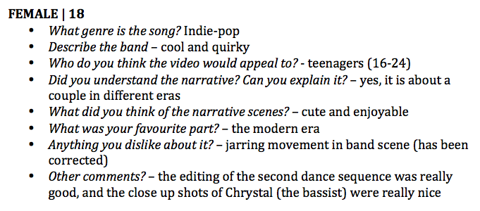
From the interviews, it is clear that the dance sequence is most people's favourite part of the music video. This could be due to it gratifying the entertainment needs of the audience, as it is visually stimulating and 'fun'. The survey we conducted also implied that the dance sequences are the favoured part of the music video:
8 out of 12 said that the dancing was their favourite part in the survey, and all four of the people interviewed also said that it was their favourite part.
However, it was also interesting that the modern scene was a favourite part due to it being relatable to the audience - we hoped to achieve this when planning the video, as we wanted the modern narrative to be realistic and actually referencing real life scenarios and culture.

It is also clear that we were successful in conveying the genre of the band, as all four interviewees, and every person who filled in the survey were able to identify the genre as indie and/or indie-pop.
Every person said that the video was indie, and almost every person said that the video was pop.
We were also successful in conveying the band identity through the music video, as the audience described them as "upbeat", "fun" and "quirky" - however, we were less successful at conveying the more 'cool' side to the band, which we had originally planned.
The survey answer
Our original plan for our artist.
It also became apparent through our audience feedback that our narrative could have been clearer - we found that whilst our audience understood that the narrative was about love and was set in different eras, some didn't understand that it was different couples in each era, whilst some didn't understand the narrative at all:
In hindsight, I would try to make the narrative clearer, or less complicated, in order to ensure that the audience are able to understand the narrative.
We also asked what our audience would improve about the video - it was interesting to see that some would make no improvements. We received some interesting criticism as well, such as:

One person felt that the ending was jarring due to the editing, and that it could have been smoother. It was also said that someone "would try and have some definitive end" to the video, as they felt that the couple walking off wasn't a clear or concrete enough ending. As a group we struggled to come up with a clear enough ending, and had planned to have the couple walking away from camera holding hands - however, on the day of the shoot we decided to incorporate the couple's exit into the dance, and found that them walking off frame was the smoothest action, as they would have walked into the set behind them if we had gone with our original plan. However, I do agree with this criticism, as I feel we could have planned out the ending better.
Again, this was an issue we had already discussed as a group; whilst we had planned to have a minimalist set style, some were more so than others. For example, the 80s narrative set consisted of just a bench - we knew that this may have looked empty, but we were unable to find a solution that wasn't to difficult for us to source in the amount of time we had to plan and shoot.
ALBUM ART

From the interviews, we learnt a number of things:
  • The 19 year old felt that the album cover would just blend in as it was too dark. She also suggested that white would have been a more eye-catching colour to have used, and would have made the rainbow outline more vivd and effective. It was also said that the dark colour didn't reflect the genre of the band - it was more serious than the music that the band were producing, and therefore didn't fit. I think this is valid criticism, as our band is more indie-pop than just indie, so are less serious. However, as a group we made a decision to make the cover black as we felt it was eye-catching, and also as the rainbow effect was only possible to achieve with that colour background. Whilst some thought it was too dark and unfitting, others thought that is was "dramatic" and "fun".
  • However, everyone liked the image on the inside, and felt that it better reflected the genre of the band because it was bright and quirky. This was what we were hoping to achieve with that image, so this feedback was encouraging. It was also encouraging that some audience members understood the "quirky with serious undertone" image that we were trying to put across with our album art; however, I feel we could have either made this more explicit, or made it less complicated by choosing one characteristic of the band identity to put across.
  • There was also the criticism that the album art looked too generic; we possibly could have avoided this with an image on the front, but as a group we decided to only have the band logo on the front, and images elsewhere. It was also said that it provided what was expected of an album art (such as the track names), suggesting that we successfully used the conventions of an album cover.
  • It was interesting to note that every person interviewed would not buy an album without knowing the music or the band - this highlights the importance of having good synergy between texts. We found that some would pick out album up, and buy it if they researched the band and liked the songs, whilst others said that it wasn't eye-catching enough to even pick up.
WEBSITE

From the interviews, we found that:
  • All those interviewed said that is was upbeat, colourful and eye-catching, and definitely reflected the more pop, light-hearted side of the band genre and image, as it connoted the upbeat nature of indie-pop with fonts, style and colour. However, some said it didn't necessarily highlight the more serious side of the genre or band image, despite the dark background. Whilst we chose to have this colour background to ensure synergy with the album art, we could have possibly chosen white, for much the same reasons as the album art.
  • It was also said to be believably a professional website, which suggests that we were successful in maintaining conventions of band websites.
  • There were still mixed opinions on clarity; some said it was clear and easy to use, such as the links at the top, whereas others said that it was slightly "busy", such as the scrolling advert at the top. It was said that the advert would possibly distract from the actual content on the page. We could have avoided this by either not having the advert at all, or using less bright images.

4) How Did You Use New Media Technologies In The Construction And Research, Planning And Evaluation Stages?

We used a range of new media technologies during both research and planning and construction. This helped us to not only communicate within the group, but it also helped us to achieve three final products.

RESEARCH AND PLANNING
WEB 2.0
  • Facebook - We initially made a group, which included all four members. This was extremely useful for us as it meant we were able to communicate with each other easily, such as organising group meetings or deciding on costumes.
Each member can post in the group, and all the others members can see and comment on the post - this meant we were able to discuss issues and ideas even when we weren't together in person.
 We also used it to share photos from the shoots, publicity shots, and initial costume ideas.

We organised and posted reminders about group meetings in school.
  • YouTube - We took advantage of the technological convergence, and used YouTube to watch inspirational music videos, and research references for eras - for example, we watched clips from Grease to get costume ideas and dance moves:
  • Pinterest - We used this website to bring together reference images for the different era costumes, as well as the band image. This was extremely useful as it meant we could easily look to a collection of images when deciding on final costumes.

MOBILE PHONES
We were also able to take advantage of technological convergence by using our mobile phones, which are also portable devices. Firstly, I was able to use my mobile phone to communicate with our lead actor, Jacob. I would send him reminders about shoots and costumes to make sure that he knew what was happening with each shoot:

We could also use our phones to post on the group Facebook page, and to see what other members had posted. This was useful when we were away from computers, as it meant each group member could stay up-to-date easily due to our phones being portable devices. 
We were also able to use our mobile phones as cameras, to take photos of and film the research and planning process. For example, we took photos of the casting process (middle image). We could then refer to images when discussing ideas and issues.

CONSTRUCTION - PRODUCTION
CANON 5D MARK II
When shooting, we used the Canon 5D Mark II, as it shot in 1920 x 1080p, in 16:9 aspect ratio, and had HD video capability. I had never used this camera before for filming - I had only used it for taking still images for coursework in Year 11. However, the camera was easy to use once our Media Technician had explained what to do, and we found that the camera was the best choice for us, as we could also adjust the white balance and contrast on the camera itself when shooting, meaning we got the best possible footage from each shoot.
However, one problem we found with the camera was the focusing. It was manual focus, which meant that it was vital we focused each shot properly before shooting, which didn't always happen. This led to quite a few reshoots, although we were much more aware during these shoots.
LIGHTING DESK
For the lighting, we used a Leapfrog Lighting Desk, which controlled the Arri 1000K Lights in lighting rig with colour filters.
No one in the group had used the lighting desk before, so we were taught by the Media Technician before we began shooting, where we were able to make pre-set lighting settings that we could quickly select during shoots. Being able to control the lighting meant we were able to light the shots how we wanted to; for example we were able to choose what colours we used for each era background. We had to compromise one colour choice as it was not available in the filters, but we were able to decide on a different colour quite easily as there was still a large enough range that there were noticeably different colours for each era.


One problem we had with the lighting rig was how long it took to change the lights for each set up - because we were sharing the studio with other groups, we had to move the lights before each shoot, as different groups had different lighting set ups. This meant a lot of time was wasted at the beginning of each shoot. However, this was unavoidable, so we had to just light as quickly as possible without compromising quality.


CONSTRUCTION - POST-PRODUCTION
PREMIERE PRO
Editing
To edit our footage we used Premiere Pro - personally, I had used this programme before, not only at school for coursework (such as the film opening last year), but also outside of school as I have self-taught myself many editing techniques. Premiere Pro was very effective when editing the video, as we could do non-linear editing, meaning it didn't matter what order we edited our footage in. Premiere Pro was also useful as we could have multiple sequences when editing, so we could test out editing techniques on a separate sequence from the final edit.

I did, however, learn a new editing technique when editing the last dance sequence. After feedback, we decided as a group to make the editing different in the second dance sequence from the first, to ensure variety within the video. This was the first time I had done a split screen effect in Premiere Pro. It was much more simple than I had initially thought; we used the Crop effect as well as the Motion settings in the Effect Controls tab, which we used to move and cut down each shot.
However, there were some effects that we tried that didn't work:
We tried to split the screen horizontally, so that our characters were made up of two bodies to highlight that the video was about how love transcends time. However, this effect didn't work at all, due to each dance in each take being in slightly different places. This was incredibly disorientating, along with the fact that the characters appeared to have more than one arm, such as in the screenshot below, where Jacob appears to have two left arms, and disjointed legs.
Grading
We also used Premiere Pro to grade the footage. I found this much less difficult than the split screen effect, because I have had a lot of practise with grading. However, it was quite time consuming to try and maintain a consistent look throughout the whole music video.
We used:
  • Procamp, to edit brightness, contrast and saturation
  • Three Wheel Colour Correction, to colour correct shots, such as making skin tones less yellow in the band shots for example
  • Change Colour, to change certain colours, such as making the whites more pure in the band shot

On the left is ungraded, on the right is graded.

AFTER EFFECTS
However, we had to use After Effects to grade the 80s narrative scenes, as the grading software in Premiere Pro was not advanced enough to successfully colour correct the footage.
I personally had never used After Effects for grading before, although I had some experience in using it for layer masking and tracking from both editing at home and for coursework last year. It was quite difficult at first, but once I had spent some time on it, I feel I was able to mostly correct the footage to a standard that fit with the rest of our video.
I used Colour Finesse 3 to grade the footage.
In hindsight, I would have preferred not to have had to use After Effects, as I didn't have that much prior experience so I was less confident, which made me worry more than when grading in Premiere Pro. We could have avoided using After Effects by thinking through the colours of the shots more - we chose a yellow background and a yellow jumper, which caused me to completely blend into the background, and made Jacob's skin tone more yellow too. We could have chosen a better background colour for this era, in order to avoid such extreme colour change in skin tones:


On the left is graded, on the right is ungraded.

PHOTOSHOP
To edit the album art we used Photoshop. I have prior experience in using this software, again from both school and home, so I was confident when using it.
For the band logo, which we chose to use as the front panel, I tried an effect that I had never done before, and followed a tutorial I found online:

This was the final product - as a group we all liked this effect the most out of all the effects I tested out for the band logo. Below are two examples of the 'metallic gold' text effect that I also tried. 
However, in hindsight, I feel like we could have used a different effect that was more versatile, as the neon outline effect only worked on a dark background, which led to us being very limited in what we could do in terms of design.

We also used Photoshop to edit the photos for the album art and website
 Above are two photos - on the left is the edited photo, and on the right is the unedited photo.

I tended to be the one editing photos, as I had the most experience with Photoshop, and I had access to the software at home, so I could use my time at school to edit the video. The tools and adjustments I used were:
  • Brightness & Contrast - this was useful for brightening shots where the lighting was too dark, and making the shadows more prominent, in order to make photos more dramatic and eye-catching.
  • Vibrancy - I used this to make the colours more rich
  • Spot Healing Brush Tool - I used this to remove any blemishes and marks on the skin, to make the band appear more flawless, and to make the photos look like real professional photos
  • Overlay Layer with Burn and Dodge Tool - I used this to darken and lighten parts of the photo that were incongruous with the rest of the photo - for example, I darkened Brandon's skin tone in the photo below, as unedited it was not a realistic representation of his actual skin tone


WEB 2.0
  •  Wix - to make our band website, we used Wix, a free site for creating your own website. This was good technology for us to use as it was designed to be easy to use, and didn't require HTML coding, which would have been difficult for us to learn how to use. A problem I found with Wix was that we were limited slightly with creativity, as we were only able to use preset widgets and apps provided by Wix. On the other hand, this meant that we could easily add features to our website, such as a live feed of the band's social media pages.

For example, we could easily add as many photos and text boxes as we wanted to each page, and could easily change the settings.

  • Facebook, Instagram & Twitter - these social media sites were useful for creating ways for fans to connect with and stay updated about the band. We created a FacebookInstagram and a Twitter page for the band, which fans can like and follow for information about upcoming events, or exclusive pictures of the band.


EVALUATION
CANON EOS 1100D and PREMIERE PRO
I filmed interviews with our target audience using my Canon camera, and edited it together using Premiere Pro. This was useful for us as it meant the group could hear feedback about all three texts, as well as use it for the evaluation. We also used my camera to take behind the scenes photos during the shoots.
This is an example of some of the interviews I filmed using my Canon, and edited using Premiere Pro.
SURVEYMONKEY
We also used an online survey conductor called SurveyMonkey, which we asked friends, family and strangers (via the internet) to fill out. We shared it on Facebook, and then used the results in our evaluation.
SurveyMonkey was good to use as it was clear for those filling out the survey. We were able to ask as many questions as we wanted and were able to customise the survey to get the best data possible. It also allows anonymous responses, so those filling it out didn't feel pressured to give details they may not have wanted to give.

We were also able to see and analyse the data as a whole after the survey had been filled out, as well as at an individual level. We could also ask both qualitative and quantitative questions, depending on what fit best.

However, due to SurveyMonkey being anonymous, we did get some answers that were obviously not taking the survey seriously, so we had to disregard the answers. In hindsight, we could have possibly avoided this by asking more people face-to-face, or actually handing out questionnaires.
 Examples of answers we had to ignore as they were clearly not taking the survey seriously.
PREZI
I found Prezi useful for presenting my evaluation in a different and interactive way, hopefully making my evaluation more interesting. It was simple to use, and was effective at presenting information clearly and concisely. However, Prezi does not support .gif files, which was not useful for if I wanted to explain an example of movement within our own music video or reference videos.

BLOGGER
Using Blogger to present my evaluation answers was also very useful, as I could take advantage of technological convergence and interactivity: I could embed different web tools onto my blog, such as Prezi and Padlet, as well as embedding videos and images. Blogger was also a good platform to use as it supported the .gif format, which I took advantage of:
An example of a gif I used in my evaluation.
However, I found Blogger was difficult to use in terms of formatting - it is quite time-consuming to ensure posts look correct, and it is easy to accidentally ruin formatting. However, I feel that if care is taken, it is possible to avoid this, and there are more positives to using Blogger than negatives.