Whilst I think there could be more to this website, such as information about the artist, or a link to merchandise, I like the style of this website, as it have a very minimalist layout. It is very to the point, and is advertising both their new single and their tour. The header image is also very striking, and conveys the indie genre of the band in a number of ways, such as the face paint on the lead singer, or the quirky poses with paper. I would like to make a website similar to this in the sense of the layout, such as having a bold header image of the band.
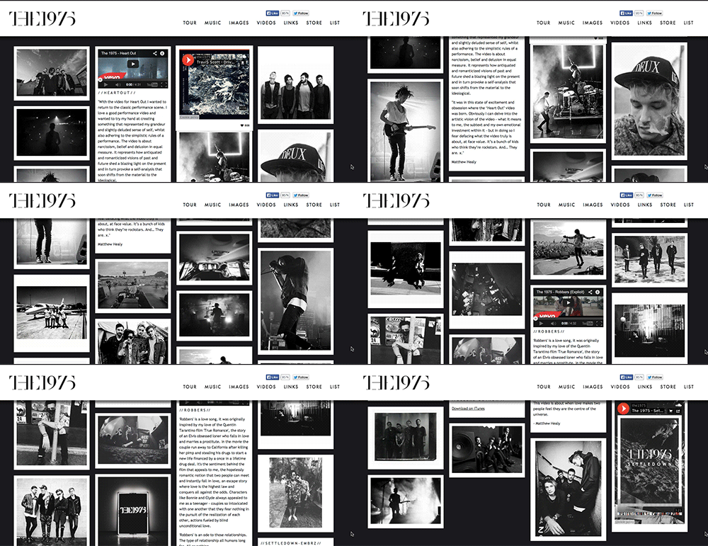
Again, I like this website for the minimalist style; I also think it is fitting with the band's image. They are known for black and white videos and being alternative, and this comes across with their website, where there is little to no colour. The website also has links to the tour, their music, their music videos, social media links, merchandise and a mailing list sign up page, so fans can easily navigate between these pages and see the content. Whilst I don't necessarily like the multiple image layout, I think it works with this website as it is still clear and easy to navigate, and not too cluttered due to the black and white theme.
I like this website as it is visually interesting, and presents the content in a unique way - instead of having separate pages, the information is scrolled between, and the background changes the further down the page. Whilst it may not convey the folk/blues genre of the artist, it is a memorable website due to the different style. There are also social media links in the top right corner, so fans are able to keep up to date on what the artist is doing. I would like to make a website like this one, although this may not be possible as this is more complex than a website with a more standard layout.


No comments:
Post a Comment