We also developed my initial idea of having images as links to other pages for the main site. Instead, we want the
website to have the same layout, but with a navigation bar on top, and the images will actually have the most recent post from that category (such as upcoming tour dates), which can then be clicked on to lead to the relevant page. We thought that it would be better to have content on the first page leading from the landing page, rather than have the audience have to click more to get to information.
The website will have the band logo, and a consistent colour scheme so as the anchor the band image and brand. It will also have images of the band to further portray their image - which is, in this case, indie.
 |
| The band logo and possible design. |
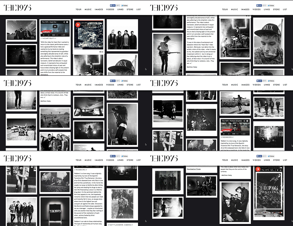
We were influenced by the layout of The 1975 website, which is like a collage with images and information, but with a navigation bar at the top. However, we don't want to have the continuous stream of information.


No comments:
Post a Comment